
One App, Infinite Vibes: Multi-Theming in React Native Expo

When I first started building my React Native app with Expo, theming felt simple, just light mode and dark mode, wasn't a big deal right? But as soon as I wanted to go beyond that, adding multiple custom themes with unique color palettes, things got messy. I needed a system that could handle more than just two modes, and at the same time work seamlessly with Tailwind CSS (Native-wind here), and still be easy to maintain. For a while, I was struggling with all of my solutions, and duplicated styles. Then, after a lot of trial and error (and a few "why is this so hard?" moments), I finally landed on a clean, scalable approach that just works.
Start by building a react native expo project (I won't go into the setup details here, expo-docs have you covered)
Once that's done, install and configure TailwindCSS using NativeWind. Again, the setup is straightforward, so I'll skip the step-by-step here. You can follow their docs: NativeWind-docs.
Before we dive into building our custom theming system, make sure to run the following command to clear out Expo's default theming and structure.
npm run reset-project
Run the project using:
npx expo start -c

Alright, now that we've got the boring setup out of the way, let's get to the fun part, building our theming system.
1. Defining colors
We'll start by setting up a solid color foundation. First, create a utils folder (or name it whatever you like) and add a colors.ts file inside.
Start by creating these objects:
Primitives
This holds all your basic, raw colors in various shades. Think of it as a library of every color available.

commonSemanticColorsLight & commonSemanticColorsDark
These objects give names to colors based on where they'll be used in your app (like "background" or "text"). We'll create two sets, one for light mode and one for dark mode.
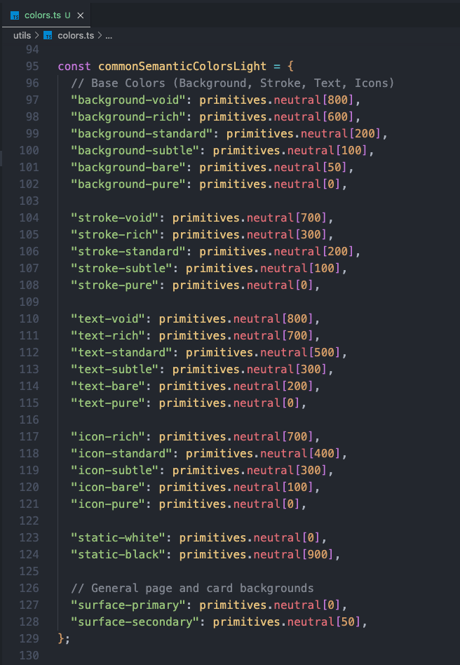
and similarly create an object for dark mode. For the values you can either revert them or add values based on your need, whatever you're comfortable with.
Next we will create a function that creates a set of colors specifically for your brand's main and secondary colors. It will pick shades from your primitives.
It allows us to easily set up and change the brand's core colors without manually picking each shade every time.

Finally, we combine semantic colors + brand colors into complete themes. It lets you change the entire look of your application by simply selecting a different theme.

rest of the code can be found in the Github repo!
and at the end you just need to export those objects:
module.exports = {
  primitives,
  themes,
};
2. Tailwind Config file
Connect your colors to the tailwind config file. This step basically teaches Tailwind about your custom themes so it can style components dynamically based on the active theme.
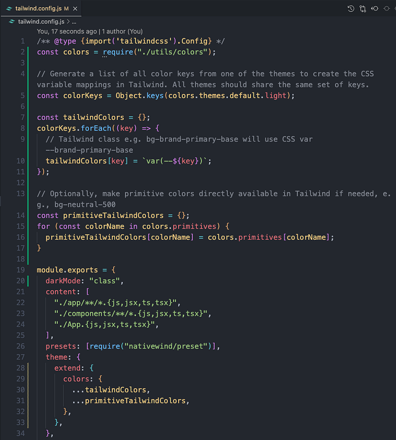
By mapping our colors to CSS variables, we can use commonSemanticColorsLight, commonSemanticColorsDark, and buildBrand colors directly as Tailwind classes.
Instead of hardcoding a color like #FFFFFF in Tailwind, we tell Tailwind: "Hey, bg-pure should actually use the CSS variable background-pure." This means when the theme changes, the variable changes and your UI updates without touching Tailwind config again.
We also map our primitive colors into Tailwind's palette. This lets you use raw shades (like neutral-500 or abyssalDepths-700) straight from the primitives object.
Now you get both worlds:
- Semantic classes (bg-background, text-primary) for theme-aware styling
- Raw shade classes (bg-neutral-200, text-abyssalDepths-800) for one-off designs
3. Theme Provider and Store
Now that our colors are mapped in the Tailwind config, it's time to actually make them switchable. We'll do this by creating a Theme Provider that listens for the active theme from our state store. We'll use Zustand for state management. It's lightweight, fast, and perfect for this use case.
npm i zustand
Once that's done, create the following folders and files:
- store/useThemeStore.ts
- providers/theme-provider.ts
Add the following content to your store:

and add the following content to your provider:

Here we have centralized Theme Management. When the theme changes in your store, the ThemeProvider re-renders, updates the CSS variables, and instantly changes the visual appearance of your entire app without a page refresh or complex logic in individual components.
Now one last step, we need to modify the store and provider to our needs.

Add a default colored theme to your store, which will be the preferred preference for the app if the user doesn't already have one.
Now update your theme provider to the following:

themeVars applies CSS variables to this View. Any child component styled with Tailwind classes (like 'bg-background-pure') will automatically pick up the correct color based on these variables.
It also provides a theme to @react-navigation/native components, ensuring their UI elements (like headers etc) match your chosen app theme.
4. Hook for theme
Next, let's make a useThemeColors.ts hook. This hook gives you direct access to the raw HEX values of the currently active theme and color scheme.
Here's how it works:
- It grabs the current theme name (e.g., "abyssal") and color scheme ("light" or "dark") from useThemeStore.
- It uses those values to look up the full color object from your themes configuration.
- It returns that object so you can instantly access things like:
- background-void
- text-pure
- brand-primary-base
- and more...

5. Theme Configuration
Now that we can access our theme colors with useThemeColors, let's make them play nicely with React Navigation. React Navigation (@react-navigation/native) has its own Theme structure, with properties like
 {
  dark: boolean;
  colors: {
    primary: string;
    background: string;
    card: string;
    text: string;
    border: string;
    notification: string;
  }
}
Our custom theme uses semantic names (background-page, text-strong, etc.), so we need a way to map them to React Navigation's expected keys. That's where useThemeConfig.ts comes in.
What it does:
- Pulls the current theme colors from useThemeColors.
- Maps them to the NavTheme structure.
- Automatically switches between light and dark mode for navigation.

With this hook, your navigation UI (headers, tabs, backgrounds) will automatically match your app's active theme, no extra styling needed.
6. Persisting the Theme
So far, our theming system works great but if the user closes the app, we lose their theme preference. Let's fix that by persisting the selected theme and color scheme.
Install expo secure store:
npx expo install expo-secure-store
The useSelectedTheme.ts hook will:
- Load the last saved theme + color scheme on app startup.
- Update our global useThemeStore with those values.
- Sync NativeWind's internal color scheme so Tailwind classes match.
You can view the source code of this file from the Github repo.
7. Using the ThemeProvider Layer
Second last step is to provide the theming to the whole app. We can do this by simply wrapping the root layout with the ThemeProvider.

8. Theme Mode and Scheme Toggle
Now that our ThemeProvider is ready, we just need to wrap our root layout with it so the entire app can access the theme.

And that's it, your theming should work perfectly fine now!


And that's it, you now have a fully scalable theming system in React Native Expo that plays nicely with Tailwind, React Navigation, and even remembers your user's preferences. If you want to see the full code, extra examples, and maybe a few things I didn't cover here, check out the GitHub repo: